How to Design icons
The five rules of good icon design
If Dieter Rams had designed icons, he probably would’ve said the same thing: “Good design is as little design as possible.” And he’d be right—great icons are built on simplicity, clarity, and honesty—just like the best product design.
Braun x Dieter Rams icon by Yunjung Seo. Modern UI icons often reflect the same minimal, pure, and geometric style found in Dieter Rams’ product designs for Braun. His influence shaped not just physical products that surround us, but also digital interfaces and the visual language of brands like Apple.
—
01 – Good icons are universal
Icons need to work for everyone, everywhere. That starts with picking symbols people instantly get—no matter where they’re from.
Avoid metaphors that only make sense in one language or culture. A universal icon speaks without words. And for common ideas as “Like”., “Download”, or “Wi-Fi”? Use the classics. There’s no need to reinvent what already works.

Don’t reinvent the wheel. When a metaphor is already familiar, focus on styling it to match your brand or project.

Signage system by Evgeniy Artsebasov—a great example of taking a familiar icon metaphor and giving it personality through a bold, angular style. It stays recognizable while standing out.
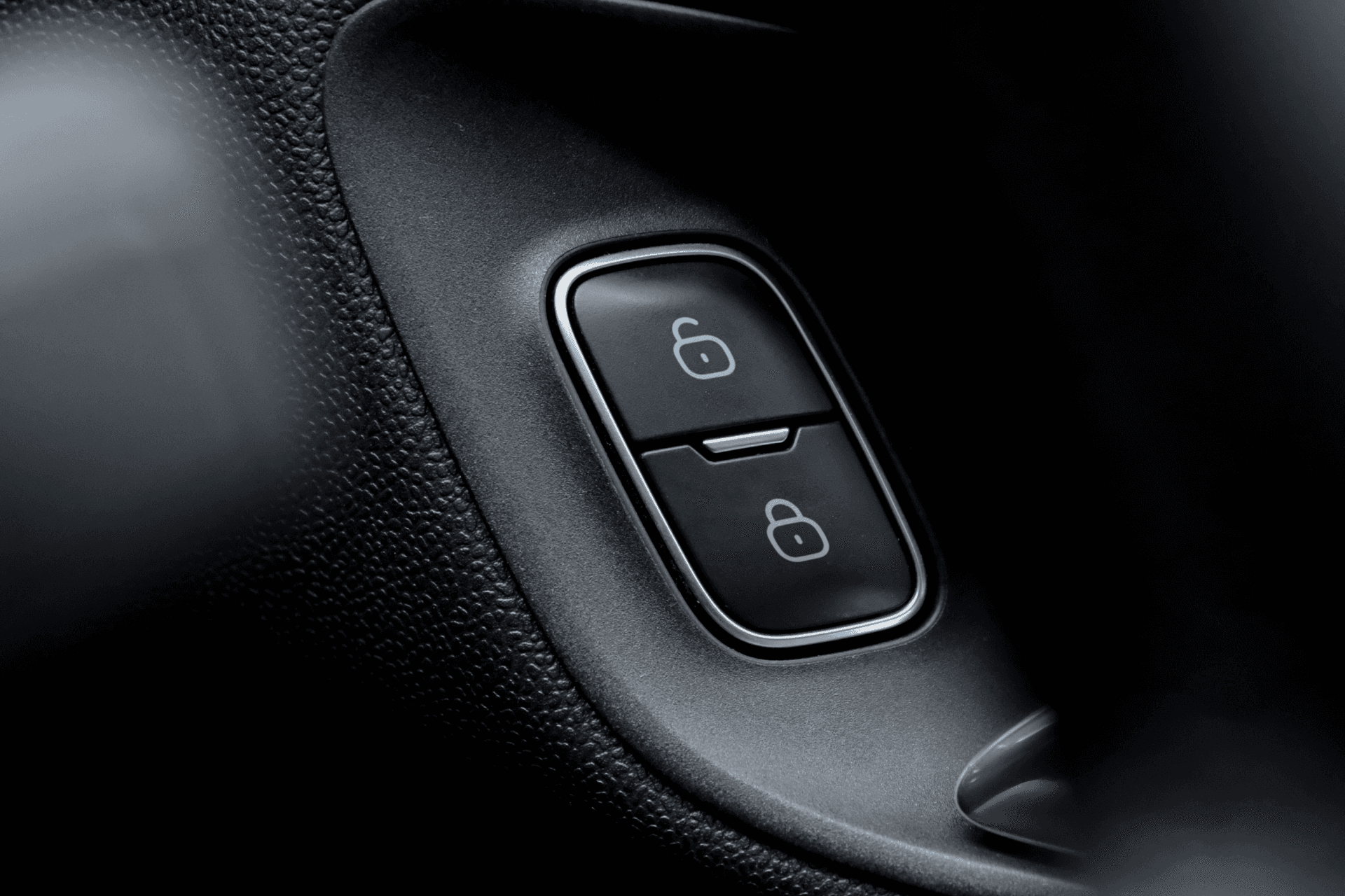
Car lock using Flex Line icons—a great example of pairing a familiar lock/unlock symbol with a style that matches the rounded shape of the car’s button. Functional, yet visually cohesive.

Packaging labels using Sharp Solid icons—classic symbols with a bold, almost brutalist edge that perfectly complement the boxy form of packaging. Clear, strong, and built to stand out.
—
02 – Good icons are simple
The best icons are clean and easy to read. Simplicity helps users recognize meaning quickly—especially in fast-pace browsing and using app interface. But there’s a catch: simplify too much, and you risk losing legibility.
Don’t oversimplify. Icons need just enough detail to stay clear and recognizable—minimal, but never bland. The best ones hit that sweet spot: clean, functional, and full of character.
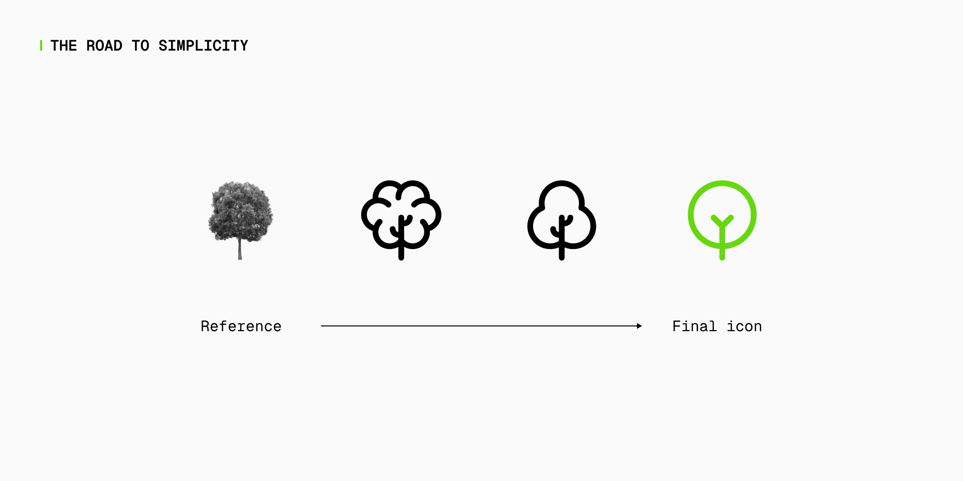
4 steps to progressively abstract a tree shape. The last two versions work equally well—it just depends on the level of detail defined in your icon set guidelines.
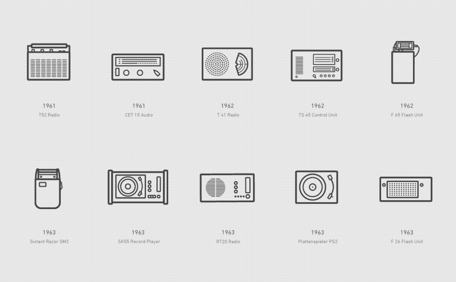
The Braun icons by Iconwerk are a bit more detailed and stylized than your typical set—but they remain clear and easy to read. They stick to a familiar UI line style, but add a twist: subtle hand-drawn touches and charming details, like the little smiley in the recycle icon. It’s a great example of adding personality without losing clarity.

The icons on the FontBase homepage lean into abstraction—almost too much. You’d probably struggle to guess their meaning without the labels. It’s a risky move that puts style and branding ahead of clarity, but in this case, it works. They’re not meant to explain—they’re there to create visual anchors and give the brand a sharp and unique style.
—
03 – Good icons are legible
Always test your icons in real-world conditions. Drop them into actual UI layouts, try them on small buttons, and view them at 16px or smaller. Do they still read clearly? If not, it’s time to tweak.
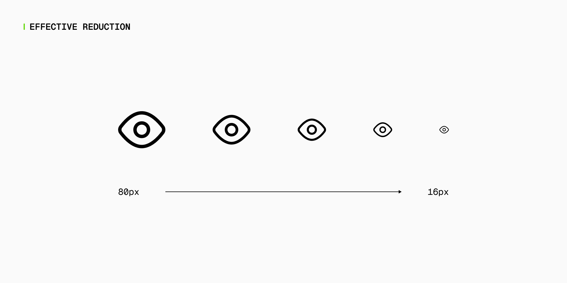
By scaling down well, icons stay adaptable—essential for today’s digital world, from tight mobile screens to responsive web layouts.
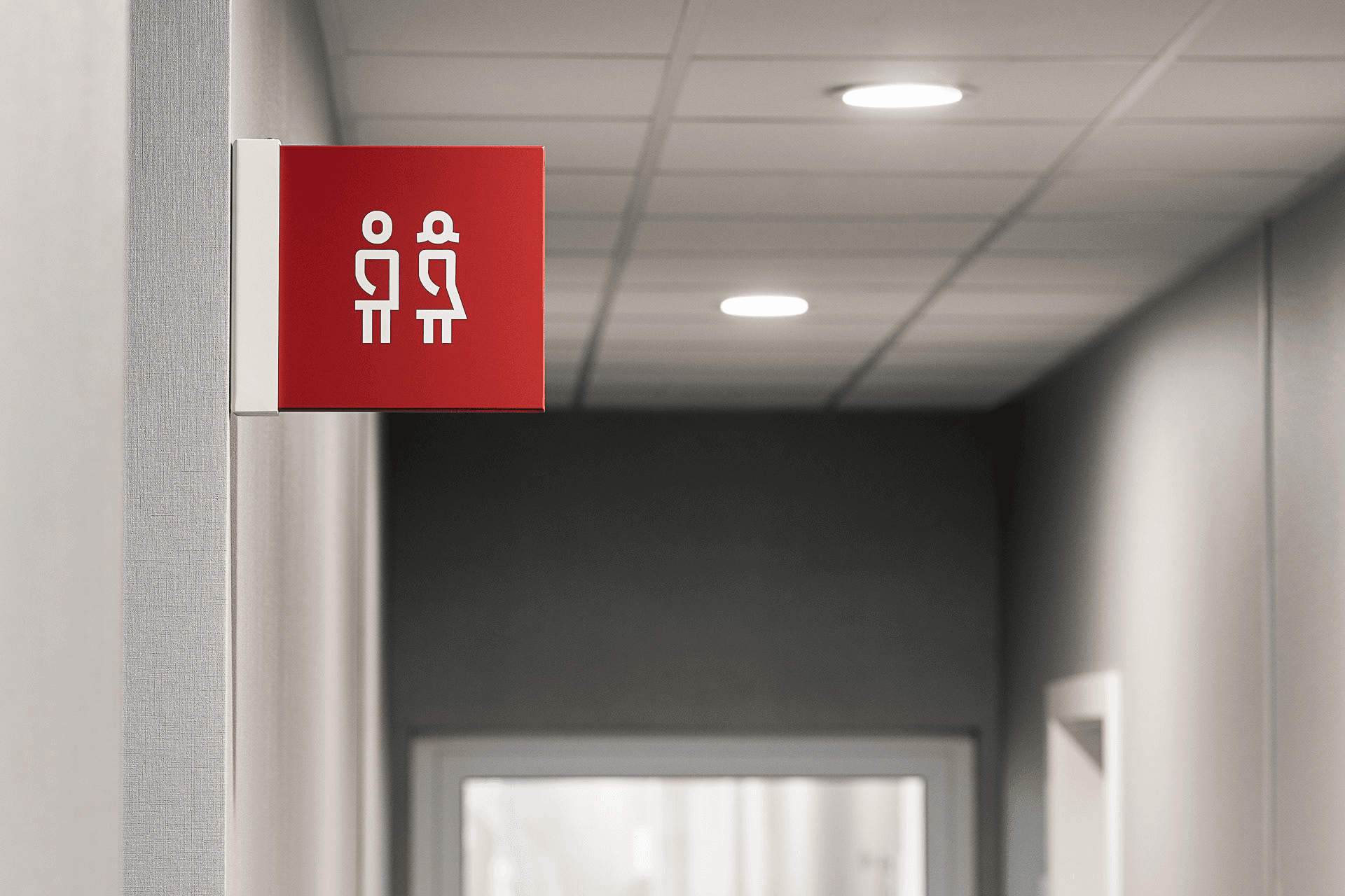
Signage system by Blank Studio. With bold lines, clean geometric shapes, and just the right touch of curves, these icons manage to be both stylized and unique—while still staying legible from a distance, which is essential for wayfinding. Notice the smart use of negative space around the curved arms: it’s just enough to keep them distinct without distracting from the icon’s overall structure.
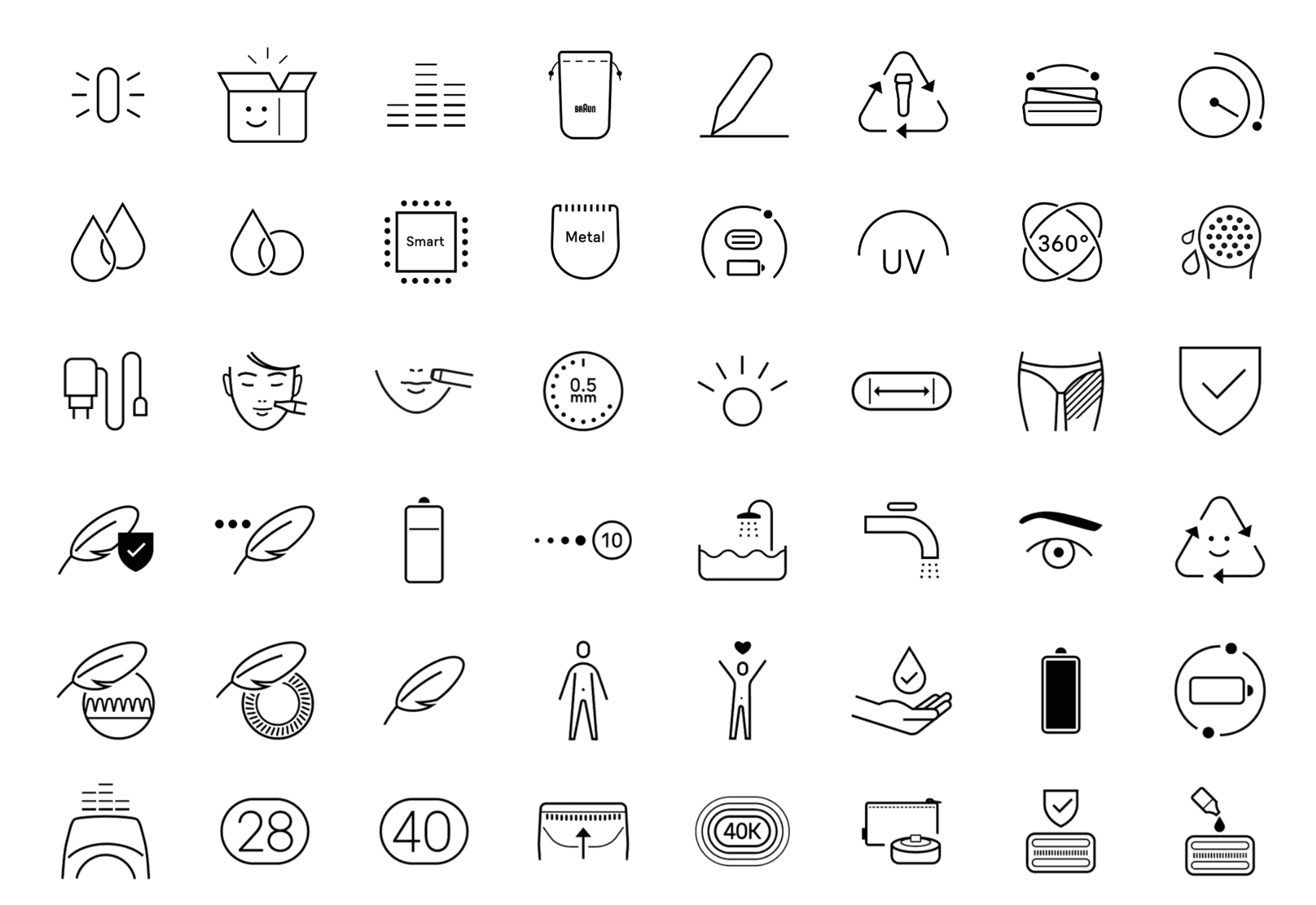
Micro Solid icons demonstrating their legibility at small sizes. This set was designed from the start for ultra-small sizes—built on a tiny 10px grid. Each icon has just enough detail to stay recognizable, with clean geometric shapes softened by subtle curves and rounded corners for a friendly feel.

Core Line icons are a clean, highly legible set built on the simplest structural conventions of icon design. Every unnecessary detail is stripped away, leaving only what’s essential. Subtle curves and rounded corners bring just enough warmth to balance the minimalism. That’s why they pair so well with typefaces that share a similar minimal yet humanist feel—like Helvetica or Inter.
—
04 – Good icons should speak without words
Icons should generally avoid using text, since it rely on specific languages or cultural contexts. As we’ve seen, icons are symbols designed to cross language barriers. They create a more accessible, universal experience—no translation needed.
That said, a few letter-based icons have become widely understood over time. A “P” for Parking, an “i” for Information, or even the word “STOP” are familiar enough to work globally. But these are exceptions—not the rule—and should only be used when they follow strong, established conventions.
The most important rule in icon design? Go with convention over pure logic. If people already recognize a symbol, use it—even if it’s not the most literal choice
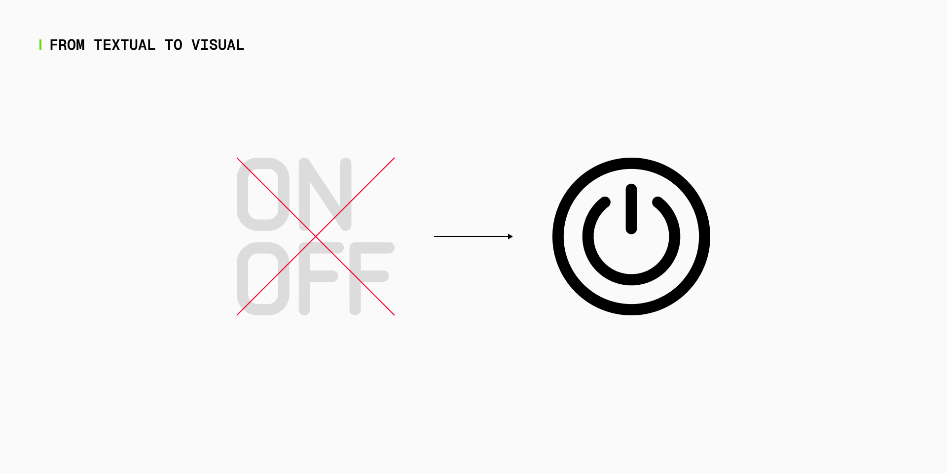
The On/Off button is universally recognized—no text needed.
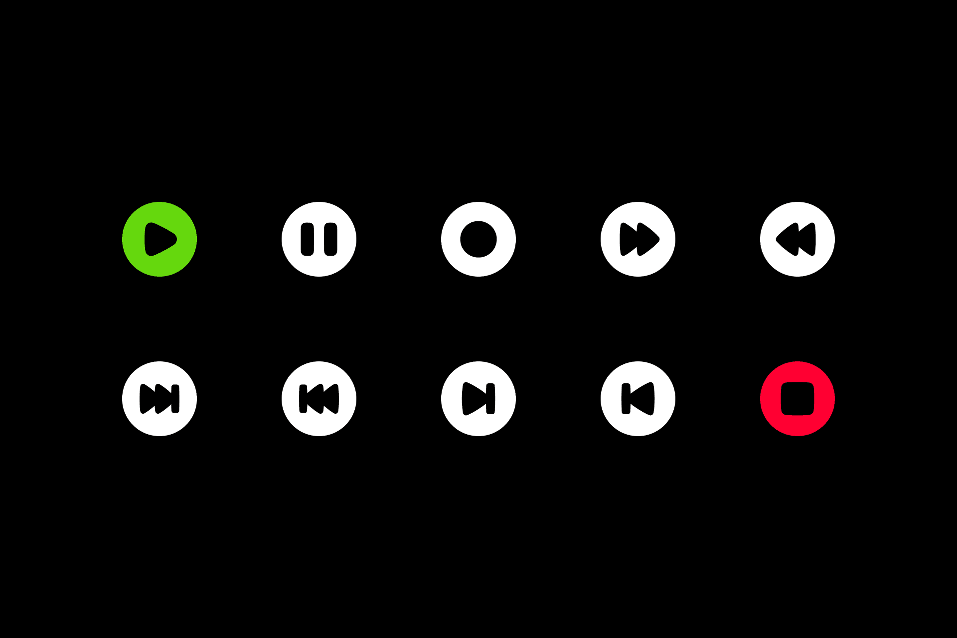
Controller icons remain recognizable without text, even with a high level of abstraction:
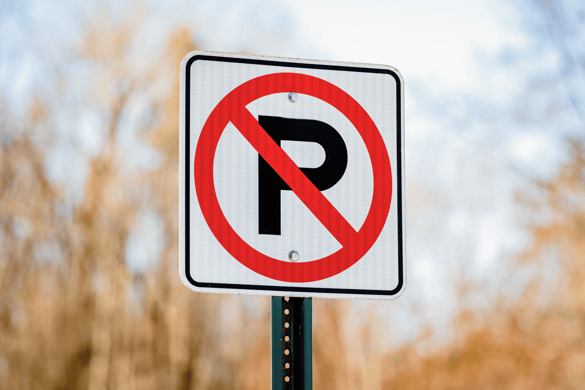
The parking icon uses a “P” because everyone’s used to it. In that case, you can use an alphabet letter.

Signage system by Studio Blisko, featuring the “i” symbol for information. While it’s based on a Western alphabet, the “i” has become an almost universally recognized icon—making it a safe and effective choice for wayfinding.
—
05 – Good icons are consistent
Great icon sets aren’t just a bunch of cool symbols—they’re a system. A good set follows clear rules: same structure, same shapes, same style. That consistency keeps your design clean and easy to use—whether it’s for an app, a sign, or a pitch deck.
That’s why icon sets should follow well-defined construction guidelines. Each icon should be built with the same grid, stroke weight, corner radius, and balance between positive and negative space. When these visual constants are in place, icons feel like part of the same family—even if they represent totally different things.

Streamline icon sets, each with its own voice. Every set is built on clear style rules—stroke weight, shape language, corner treatment, and more—to keep the look consistent and instantly recognizable.
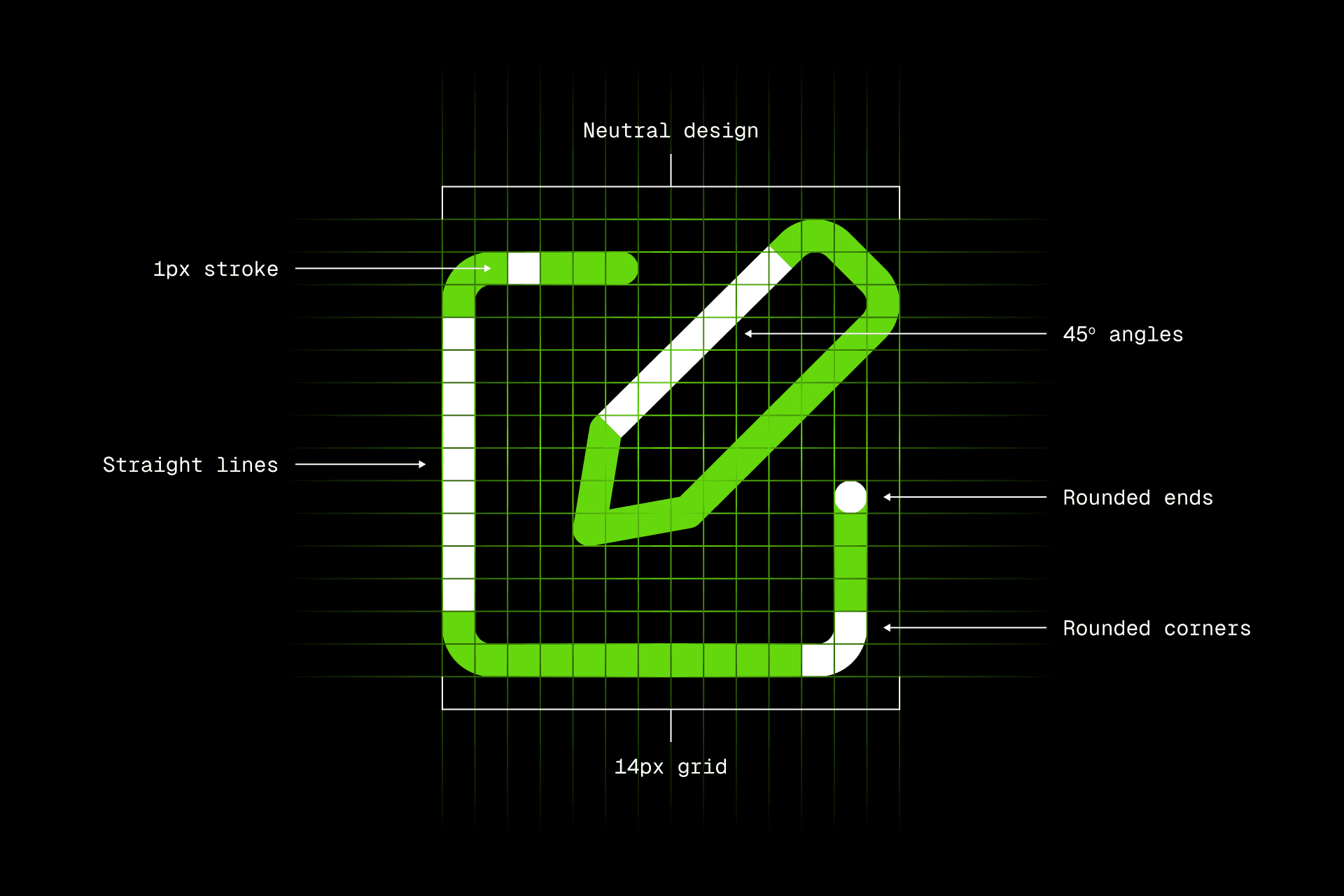
The Core Line icons are built on strict construction guidelines, applied consistently across the entire set. You can spot the underlying geometric shapes—squares, rectangles, triangles—used as the foundation for every icon. Even the pencil follows a precise 45-degree angle, reinforcing the rational structure. While this methodical approach could feel a bit rigid, it’s softened by subtle rounded corners that add warmth and a human touch. By repeating these visual principles across every icon, the result is a set that feels clean, cohesive, and professional.
The Platinum icon set stands out with two key design principles: inward and outward curves instead of straight lines, and sharp corners where curves meet, creating elegant, pointy ends. This gives the set a refined, high-end look.With thin strokes, the icons feel discreet—yet their unusual structure adds a stylish and surprising style. Repeating these guidelines across the full set creates a distinctive identity, making it a perfect fit for luxury brands and innovative companies.

