
Pick the right style
Choosing the right icon style is an art. Do you need bold impact, subtle minimalism, or retro charm? This guide explores the full spectrum of icon styles—from line to pixel—highlighting their strengths, drawbacks, and ideal use cases.
Line icons
The most used icon style—these icons are built with open strokes, showing a minimalist and lightweight appearance. Their consistent stroke width creates visual harmony, and they pair very well with most used typefaces (Inter, Helvetica..) and minimalist interfaces.
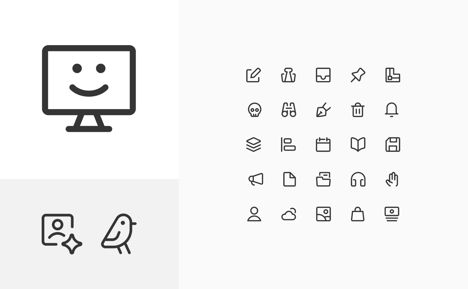
Core icons by Streamline
| Pros
• Clean, elegant, and easy to integrate with minimalist designs.
• Lightweight style, with a lot of negative space inside, that makes design using it more airy.
• Pair well with lightweight typography.
| Cons
• Less legible at smaller sizes.
• Less legible on dark or complex backgrounds.
• May lack visual impact in bold designs.
| Best for
• User interfaces (UI) for modern web and mobile apps.
• Wireframes, mockups, and prototypes.
• Minimalist dashboards and SaaS platforms.
• Brands emphasizing simplicity.
Solid icons
For bold impact—these icons use filled shapes that create a strong visual presence. Bold, prominent, and attention-grabbing, they work well in both monochrome and colorful designs, adding vibrant splashes of color when used creatively.

Core and Flex Solid by Streamline
— Pros
• Highly legible even at small sizes.
• Strong contrast on busy or dark backgrounds.
• Excellent for alerting or emphasizing key UI actions.
• Ideal for color customization.
— Cons
• Can feel heavy or overpowering in minimal designs.
• Less flexible in adapting to light themes without customization.
— Best for
• Call-to-action buttons and key interaction points.
• Navigation menus in mobile apps.
• Icons for signage or visual instructions.
• Digital products requiring bold, simple communication.
Duotone Icons
A perfect style for branding—these icons combine two contrasting tones to add depth and visual interest. The shapes are defined by a dark stroke, while the second tone fills the shape with color, resulting on legibility and a vibrant visual appeal.
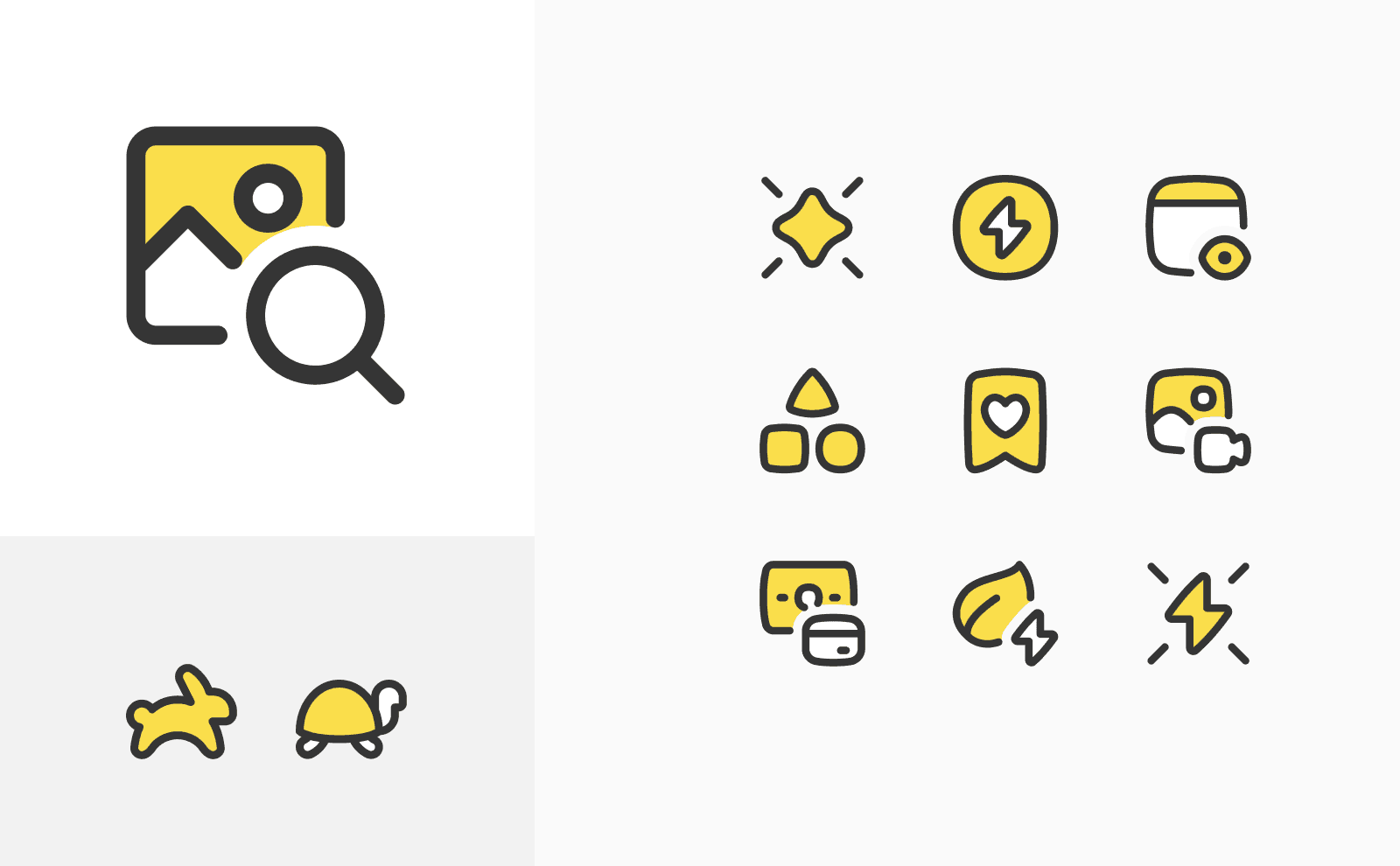
Core and Flex Duotone by Streamline
— Pros
• Adding dimension and colors to minimalist designs.
• Works well with branding by using the main brand color as an accent.
• Creates a subtle sense of depth.
— Cons
• Less legibility than Line or Solid style.
• May not suit ultra-minimal interfaces.
• Needs a bigger scale to maintain legibility.
— Best for
• Branding visuals with distinct color palettes.
• Marketing materials and creative campaigns.
• Websites and apps that need banding colors.
Hybrid icons
The perfect blend of simplicity and impact—these icons combine bold solid shapes with light, minimalist lines. The balanced composition, with consistent stroke weights, creates a design that is both minimal and strong, without overwhelming the interface.

Core Remix, Plump and Flex Remix by Streamline
— Pros
• Highly legible: Solid elements anchor the design, while lines provide clarity and subtlety.
• Modern and trendy.
• Flexible: Works in both light and dark themes.
• Great for customization: Easily adaptable with brand colors.
• The combination of lines and solid black areas creates a hand-drawn, inked effect.
— Cons
• Requires careful design to avoid imbalance.
• Thin line details can lose clarity at smaller sizes.
— Best for
• Modern branding where strength and subtlety coexist.
• Minimalist design and interface, where legibility is needed.
• Works well as illustrations, on a bigger size (from 64px).
Pixel Icons
Old-school retro charm—these icons are built on a strict pixel grid, embracing the limitations of early computer displays. Their blocky, low-resolution aesthetic evokes a nostalgic, vintage feel, reminiscent of classic video games and early digital interfaces.

Free Pixel icons by Streamline
— Pros
• Crisp and precise at small sizes.
• Appeals to retro and gaming aesthetics.
• Can scale for illustrative needs if built as vector svg.
• Pair well with pixel typefaces.
— Cons
• Limited scalability if made as pixel file like png—can become blurry when enlarged.
• Less versatile in modern, sleek designs. It got a strong vintage connotation.
— Best for
• Retro-themed digital products or gaming apps.
• Small UI elements like toolbars and badges.
• Low-resolution digital interfaces.
• Brands leaning into nostalgic, vintage design styles.
Flat Icons
Bold and contrasted—the flat icon style eliminates depth, focusing on simplicity, clarity, and clean shapes. It relies on bold, contrasting colors for instant recognition and strong visual impact.

Core Flat icons, Flex Flat icons by Streamline
— Pros
• Bold and Solid Appearance: Delivers a strong visual impact.
• Perfect for Branding: Works well with two-color schemes.
• Great for graphic design, used for adding splashes of colors.
• Highly Legible: Strong shapes and minimal details ensure clarity, especially when using bold, contrasting colors.
• Timeless and Modern: bold solid shapes create a contemporary, striking look.
— Cons
• Can lack depth and uniqueness.
• Oversimplification may lead to less distinctive designs.
• May lose legibility when using light/pastel colors or overly contrasting combinations.
• A bold style that can feel overwhelming if not balanced properly.
— Best for
• Modern mobile and web interfaces.
• Branding usage
Skeuomorphic Icons
A style that could make a comeback—Skeuomorphic icons mimic real-world objects using textures, shadows, and depth, creating a tactile and realistic feel. Designed to make digital interactions intuitive, they reference physical counterparts, offering a sense of comfort in digital experiences.

Mac OSX Leopard icons by Apple
— Pros
• Intuitive and relatable, especially for first-time users.
• Highly engaging with detailed, realistic designs.
• Could make a comeback when users are bored of minimalism.
— Cons
• Can feel outdated in modern interfaces.
• Heavier file sizes and more complex to design.
• Less versatile for scalable design systems.
— Best for
• App icons.
• Editorial or decorative illustrations.
• Projects where realism and familiarity are key.
Isometric Icons
A geometric style with depth—Crafted with a consistent 30° angle, these icons offer depth and geometric precision, creating a structured and technical visual style.
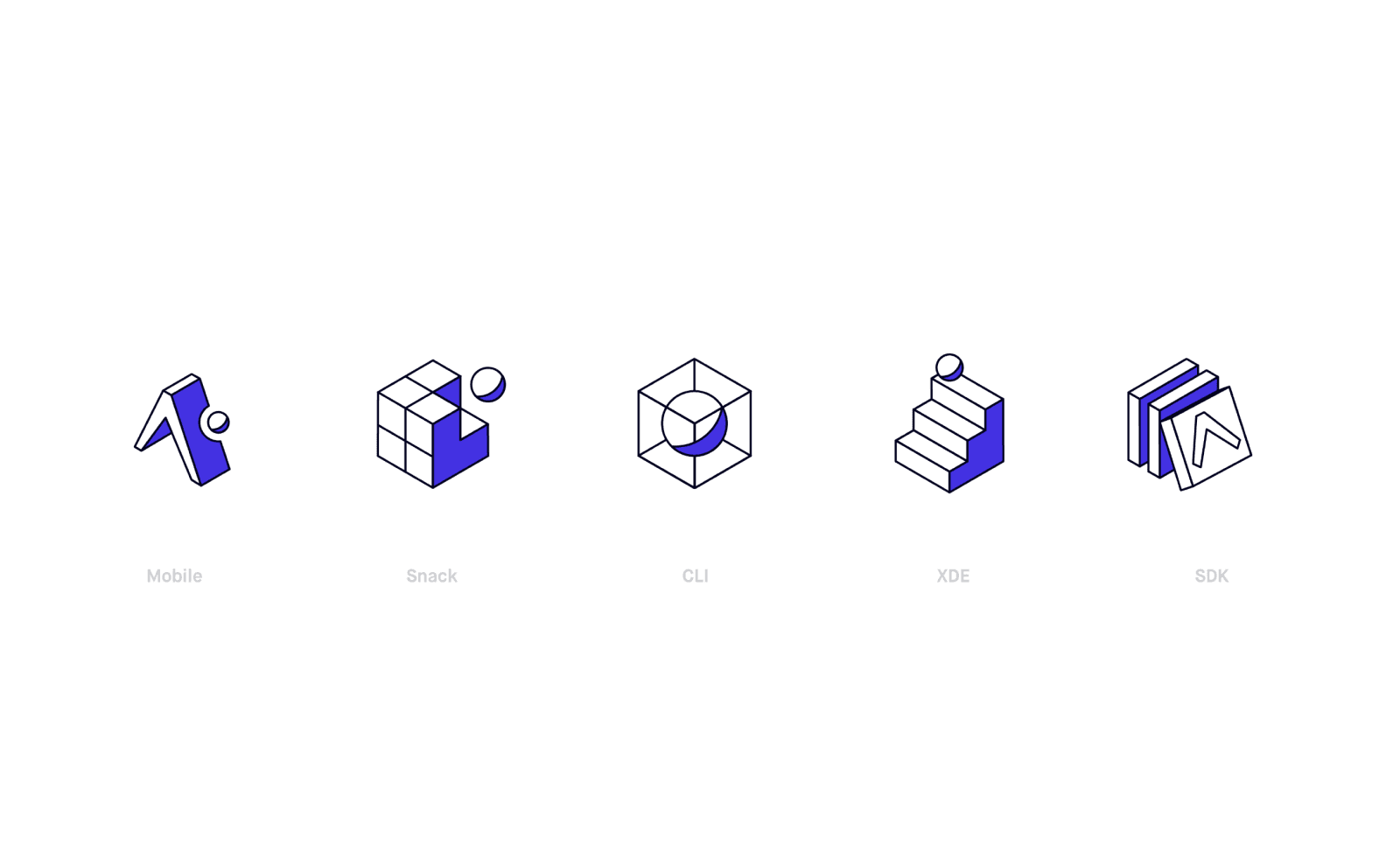
Isometric icons by Timo Kuilder
— Pros
• Visually dynamic and engaging.
• Great for illustrating complex processes or systems.
• Adds personality and uniqueness to interfaces.
— Cons
• More complex and time-consuming to design.
• Can be too detailed for small UI elements.
— Best for
• SaaS dashboards with complex data visualization.
• Marketing visuals and presentations.
• llustrative elements.
Illustrative icons
Minimalism meets artistic mood—Close to illustrations, they retain the clarity of iconic design but add a hand-crafted, artistic touch with organic lines and subtle textures. Balancing minimalism and creativity, they feel approachable while staying clear and functional.

Tic Toc Icon Set by Leo Rheeder
— Pros
• Human and artistic: Adds a crafted, personal feel to digital interfaces.
• Visually distinctive in a design space dominated by minimalism.
— Cons
• More Time-Consuming to Design: Requires attention to detail and artistry.
• Inconsistent in Overly Minimal Interfaces: May feel out of place in ultra-strict, minimal systems.
— Best For
• Branding Elements for brands that value craftsmanship and artistic expression.
• Presentation Graphic with storytelling.
• Marketing Campaigns: Adds an emotional element to visuals.
Hand-drawn
[COMING SOON]
Let's remix them all!
There is no rules for icon styles, a few example of creative use of styles
Flat style + hand-drawn

Christmas and winter illustrative icons by Elmira Gokoryan


